
Google Web Toolkit
Google Code Home
>
Google Web Toolkit
>
GWT Class Reference >
com.google.gwt.user.client.ui >
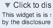
DisclosurePanel
The header and content sections can be easily selected using css with a child
selector:
.gwt-DisclosurePanel-open .header { ... }
| DisclosurePanel() | Creates an empty DisclosurePanel that is initially closed. |
| DisclosurePanel(DisclosurePanelImages, String, boolean) | Creates a DisclosurePanel with the specified header text, an initial open/close state and a bundle of images to be used in the default header widget. |
| DisclosurePanel(String) | Creates a DisclosurePanel that will be initially closed using the specified text in the header. |
| DisclosurePanel(String, boolean) | Creates a DisclosurePanel with the specified header text and an initial open/close state. |
| DisclosurePanel(Widget) | Creates a DisclosurePanel that will be initially closed using a widget as the header. |
| DisclosurePanel(Widget, boolean) | Creates a DisclosurePanel using a widget as the header and an initial open/close state. |
| add(Widget) | Adds a child widget. |
| addEventHandler(DisclosureHandler) | Attaches an event handler to the panel to receive DisclosureEvent notification. |
| clear() | Removes all child widgets. |
| getContent() | Gets the widget that was previously set in setContent(Widget). |
| getHeader() | Gets the widget that is currently being used as a header. |
| getHeaderTextAccessor() | Gets a HasText instance to provide access to the headers's text, if the header widget does provide such access. |
| isOpen() | Determines whether the panel is open. |
| iterator() | Gets an iterator for the contained widgets. |
| remove(Widget) | Removes a child widget. |
| removeEventHandler(DisclosureHandler) | Removes an event handler from the panel. |
| setContent(Widget) | Sets the content widget which can be opened and closed by this panel. |
| setHeader(Widget) | Sets the widget used as the header for the panel. |
| setOpen(boolean) | Changes the visible state of this DisclosurePanel. |
null otherwisetrue if panel is in open statetrue if the widget was presentDisclosurePanel.true to open the panel, false
to close