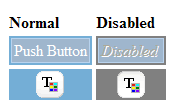
Google Web Toolkit

public class PushButtonExample implements EntryPoint {

  public void onModuleLoad() {
    // Make a new button that does something when you click it.
    PushButton b = new PushButton("Jump", "Jump?", new ClickListener() {
      public void onClick(Widget sender) {
        Window.alert("Crash...");
        Window.alert("Uh Oh...");
      }
    });

    // In a real application, you would have to have css styles defined for
    // gwt-PushButton-up,gwt-PushButton-up-hovering,gwt-PushButton-up-disabled,
    // gwt-PushButton-down,.gwt-PushButton-down-hovering,.gwt-PushButton-down-disabled

    // Add the push button to the root panel.
    RootPanel.get().add(b);
  }
}
| PushButton() | Constructor for PushButton. |
| PushButton(Image) | Constructor for PushButton. |
| PushButton(Image, ClickListener) | Constructor for PushButton. |
| PushButton(Image, Image) | Constructor for PushButton. |
| PushButton(Image, Image, ClickListener) | Constructor for PushButton. |
| PushButton(String) | Constructor for PushButton. |
| PushButton(String, ClickListener) | Constructor for PushButton. |
| PushButton(String, String) | Constructor for PushButton. |
| PushButton(String, String, ClickListener) | Constructor for PushButton. |
| onClick() | Called when the user finishes clicking on this button. |
| onClickCancel() | Called when the user aborts a click in progress; for example, by dragging the mouse outside of the button before releasing the mouse button. |
| onClickStart() | Called when the user begins to click on this button. |
PushButton.PushButton.PushButton. The supplied image is used to
construct the default face of the button.PushButton.PushButton.PushButton. The supplied text is used to
construct the default face of the button.PushButton. The supplied text is used to
construct the default face of the button.PushButton.PushButton.onClickStart will eventually be followed by either
onClick or onClickCancel, depending on
whether the click is completed.